Rekkje Stiutvikling AS
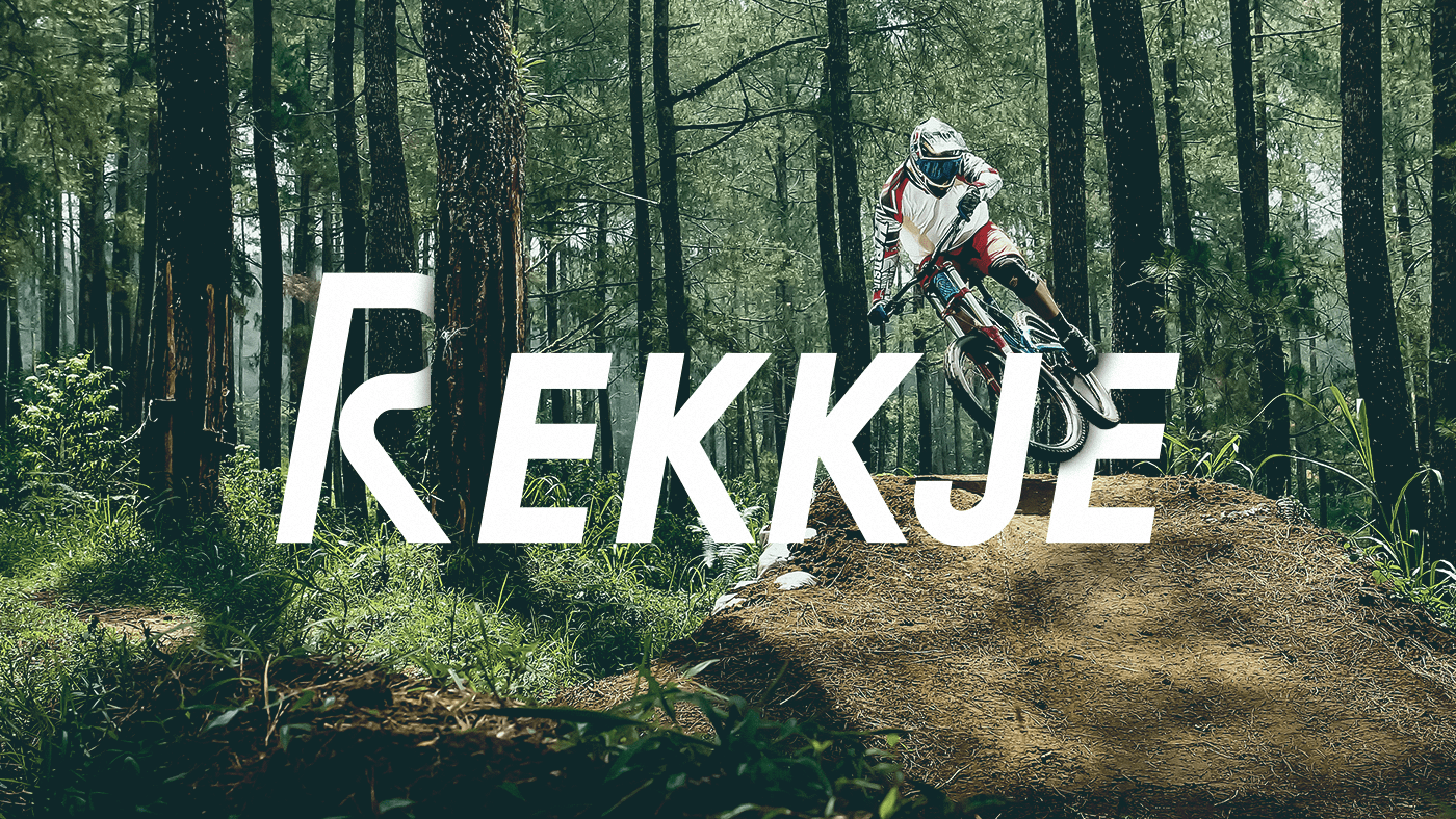
ABOUT REKKJE
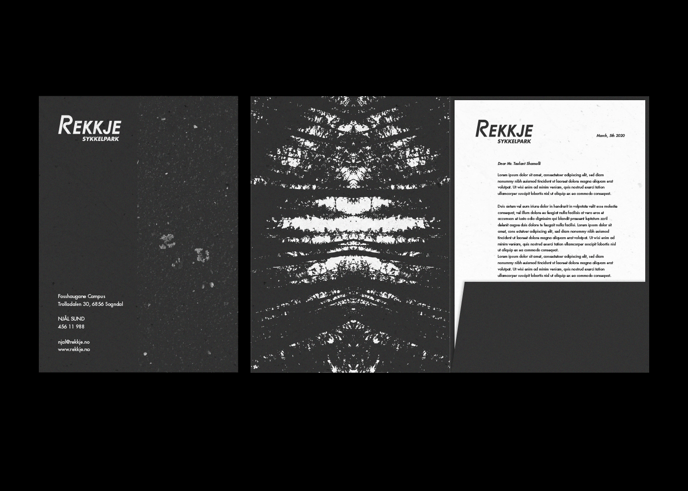
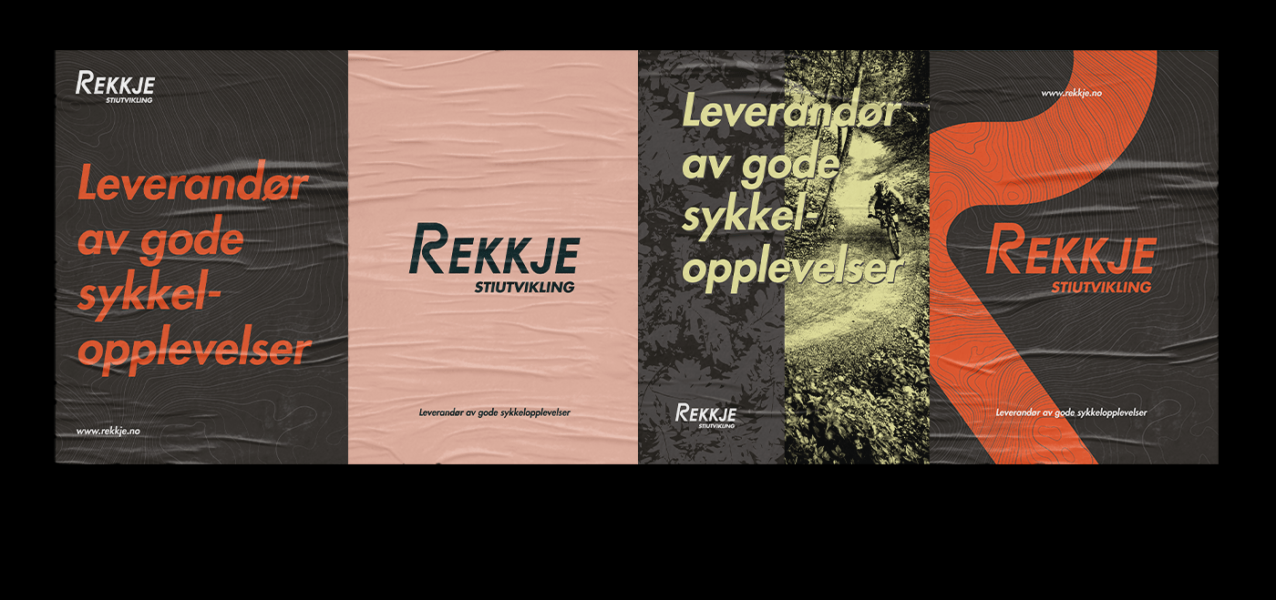
REKKJE is a company that plans, designs and builds fun cycling facilities all over Norway. They are a very special niche company, with a professional team and a quality-driven work culture and we wanted to reflect their unique-strong-values in their Visual Identity.
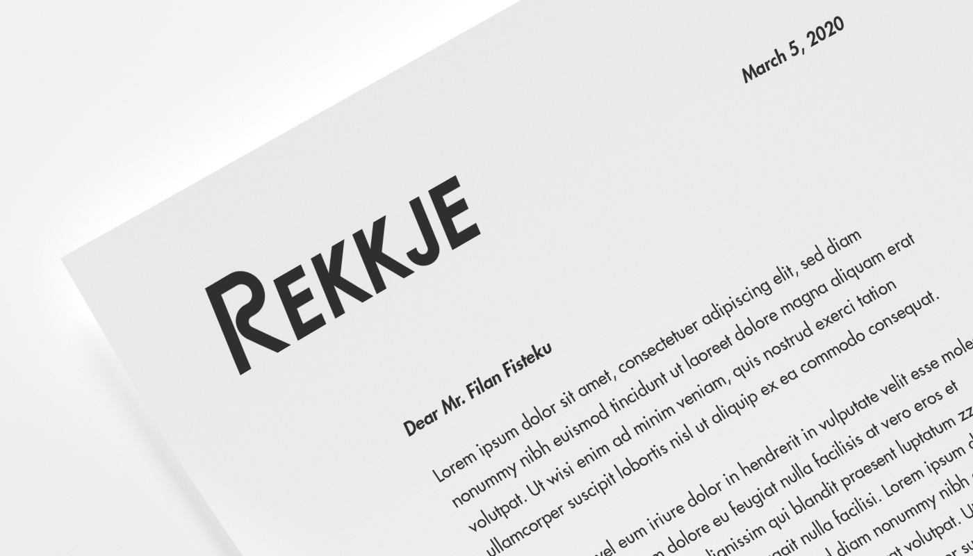
CUSTOM LOGOTYPE
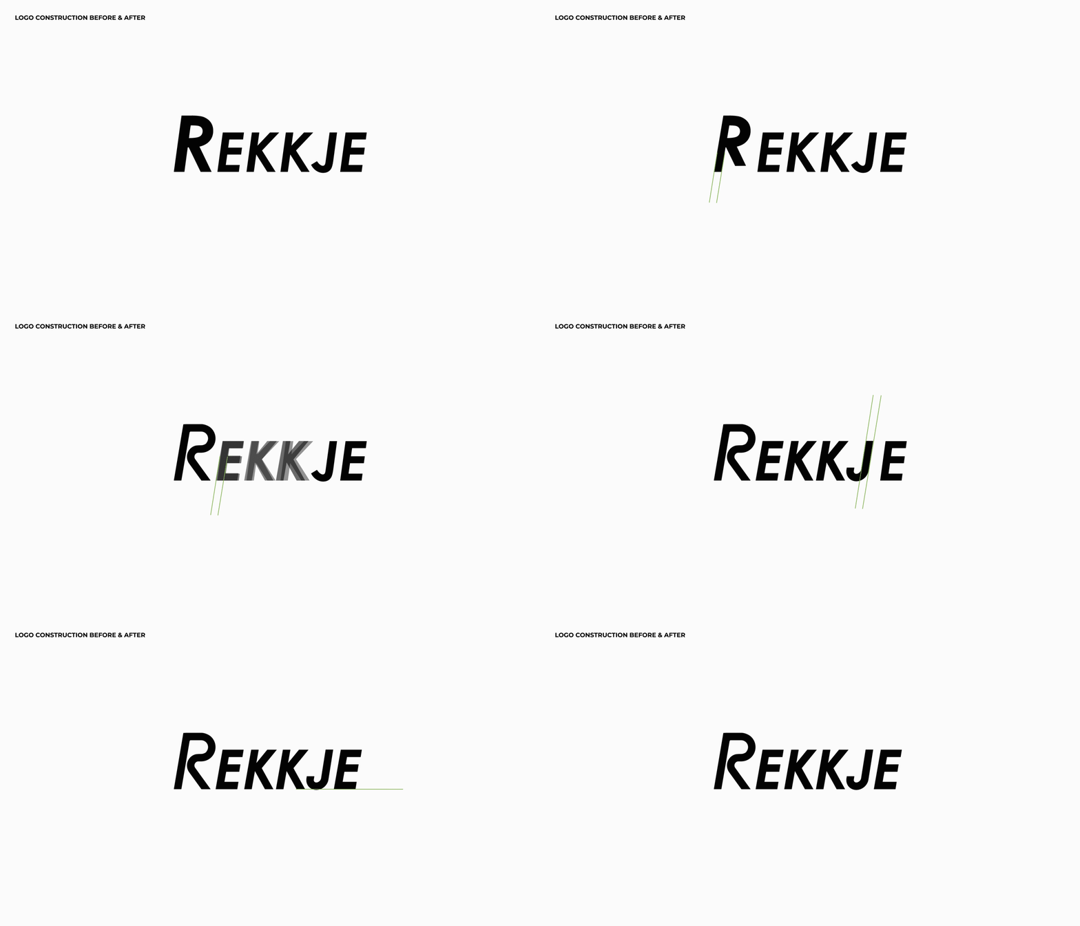
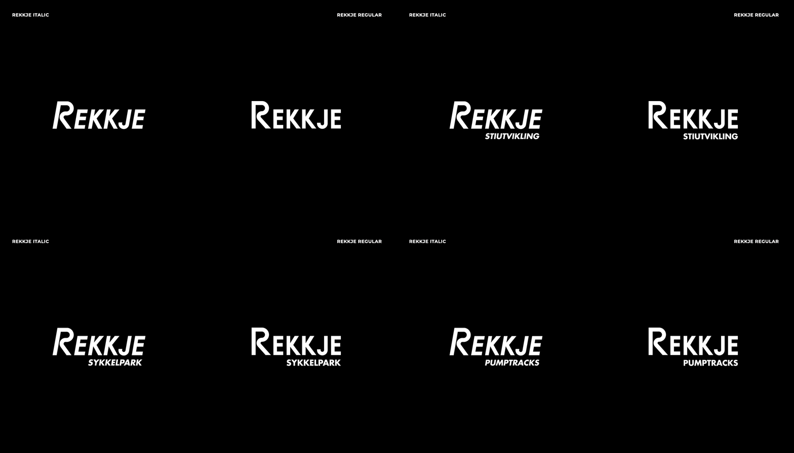
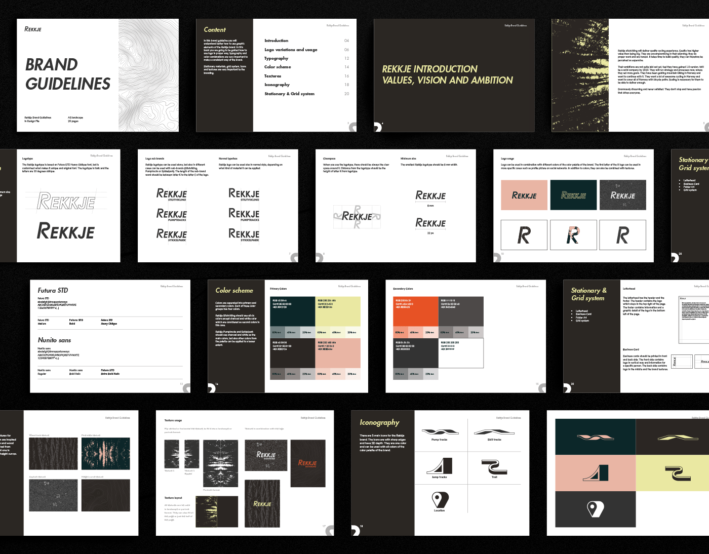
We started with the logotype by re-constructing it, we created a logo-symbol and a custom font inspired from the curved paths that REKKJE builds. The difference is seen the most in the R letter, because we didn’t want to get rid of the attitude of the last logo, we just wanted to enhance their personality, so the other letters were constructed to fit with the R letter and have an overall harmony & balance.
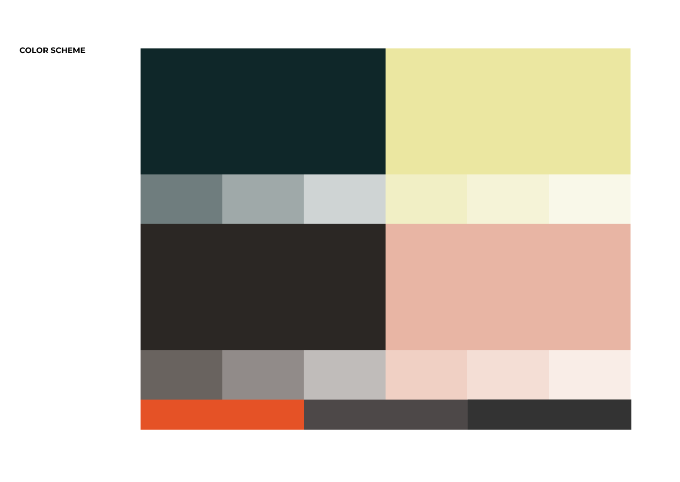
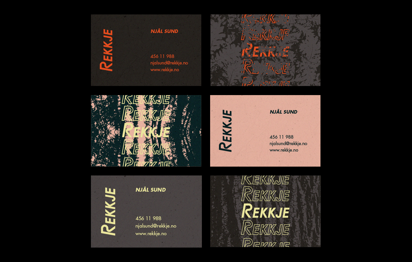
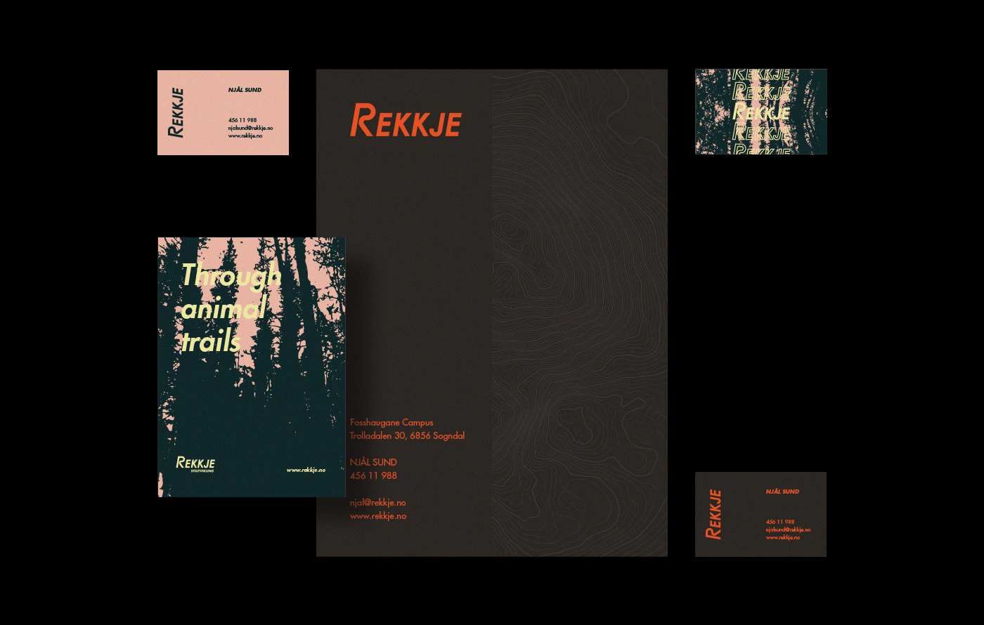
CONCEPT & VISUAL IDENTITY
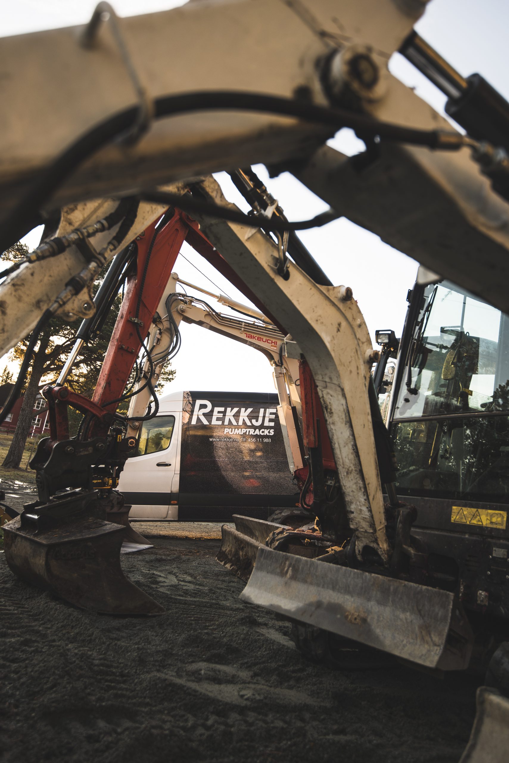
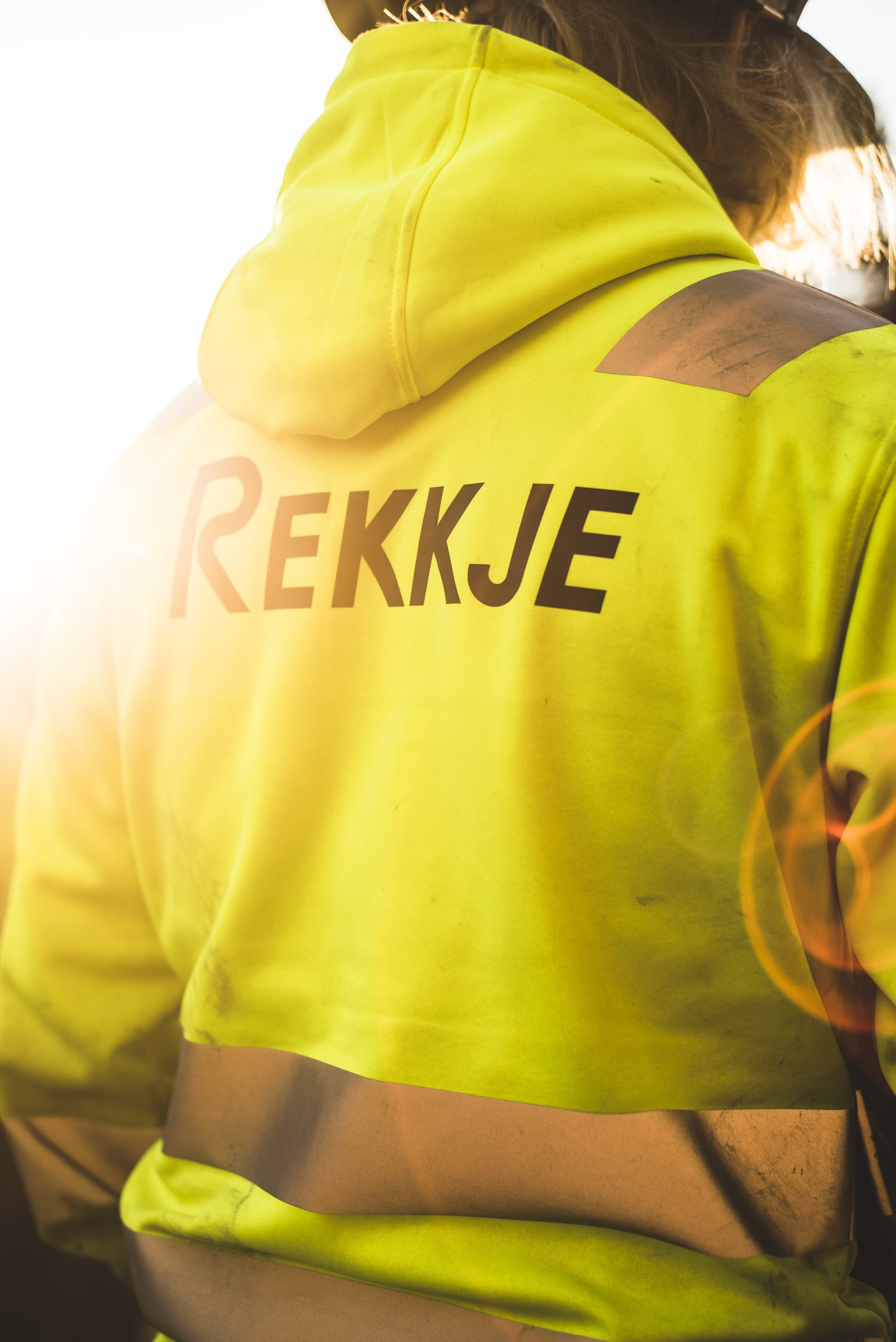
In this phase we came-up with 3 keywords that our team & REKKJE team identified their brand with the most: Scandinavian Nature, Adventure & Action; and these elements became our visual guide inspirations in creating REKKJE’S Visual Identity.
